
Even when the kids are all grown up you’re never too old to have fun.
This year I’m trying something new.
After the Easter Egg Hunt with the little ones,
I plan on having another Easter Egg Hunt for the Big Kids and Grown Ups.
(We’re all just big kids at heart.)

For the Easter Egg Hunt…
I decided to whip up a few quick tags to go along with some of the prizes using my
Xyron Creative Station* and Xyron Mega Runner* , a few sheets of paper from
Photoplay Paper’s Easter Blessings Collection along with a few simple embellishments.
*Disclosure: This blog uses ads and affiliate links. If you choose to make a purchase using one of the links, I receive a small commission (at no additional cost to you) that helps offset the costs of maintaining this blog. Thanks for your support!

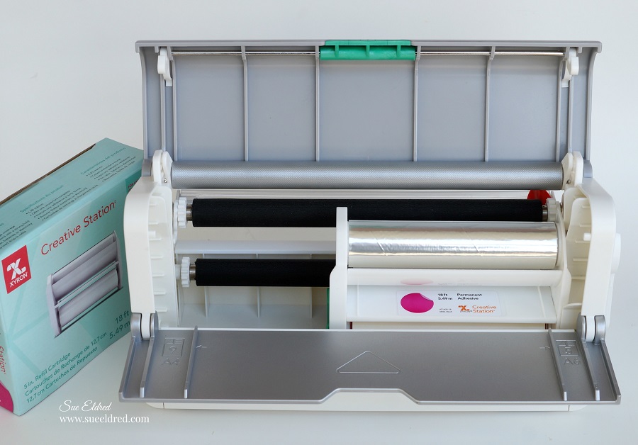
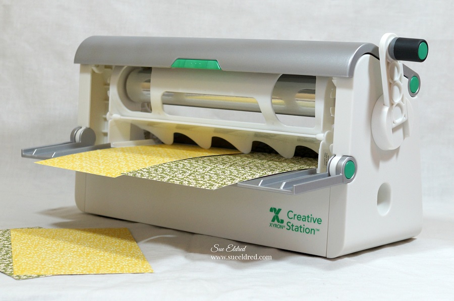
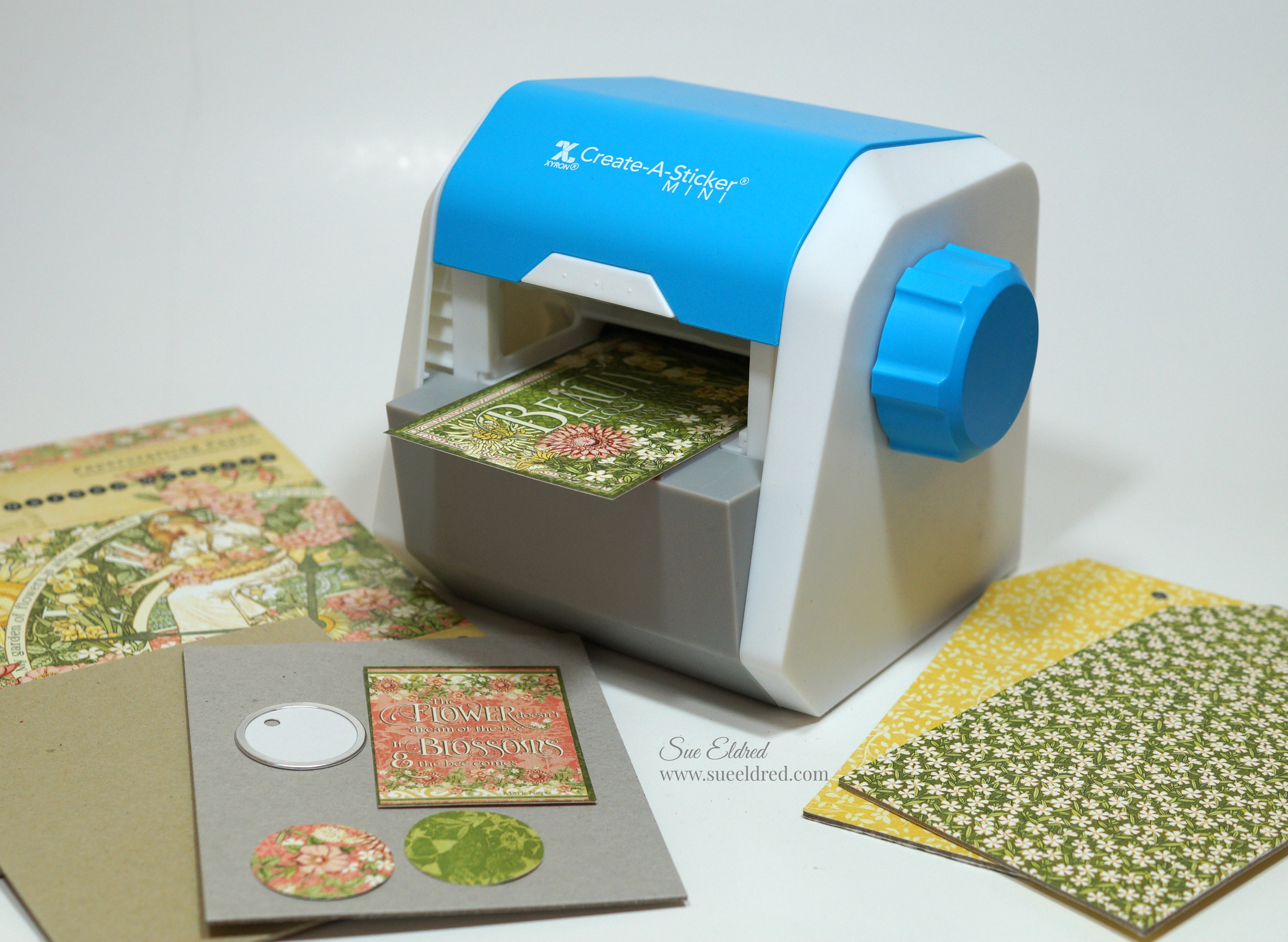
When I want to make quick work of any project, I grab my Xyron Creative Station*.
Did you know that you can interchange the Xyron 9” Creative Station Permanent Adhesive
Refill* with the Xyron 5” Creative Station Permanent Adhesive Refill*?
Being able to use both sizes of cartridges with the Xyron Creative Station*  is super convenient
when working on both big and medium sized projects.

Just lay your paper design side up onto the Xyron Creative Station* crank the handle to run
the paper through the machine. As it moves through the Xyron Creative Station* it adds
adhesive to the back side of the paper. Easy to use and it doesn’t need electricity.

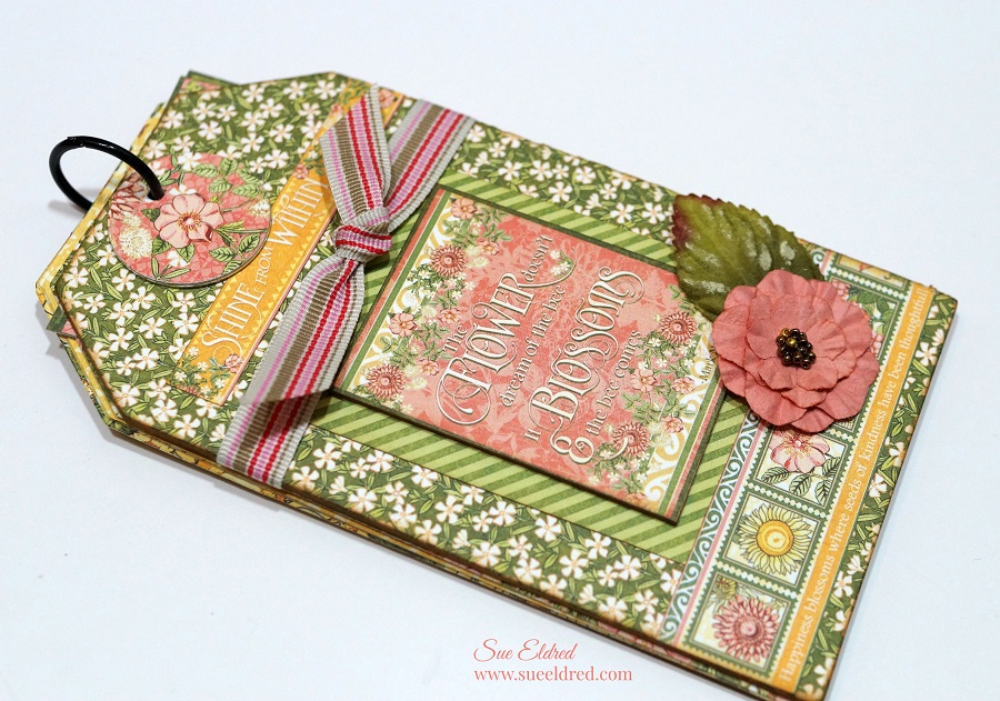
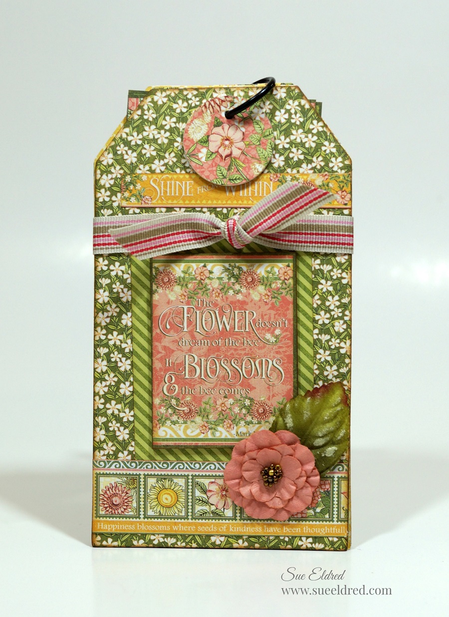
To make the tag…
I layered and trimmed the 3″ x 4″ element cards from the scrapbook paper and embellished it
with a thin strip of paper and prima flower*. Tie tag with a simple sheer ribbon onto the bag.

I added a few enamel dots from Waffleflower on the tag and a little “small talk” sticker from
Tim Holtz idea-ology.

With a little more candy for the plastic eggs and I’ll be ready for fun.

“This is a sponsored post. As a member of the Xyron Makers Program I have been provided product in exchange for my creative ideas. The views and opinions are my own.


